Download the 2024 Brochure
Detailed description and delivery options for our latest courses
Read more about data storytelling, creating impactful presentations and more.
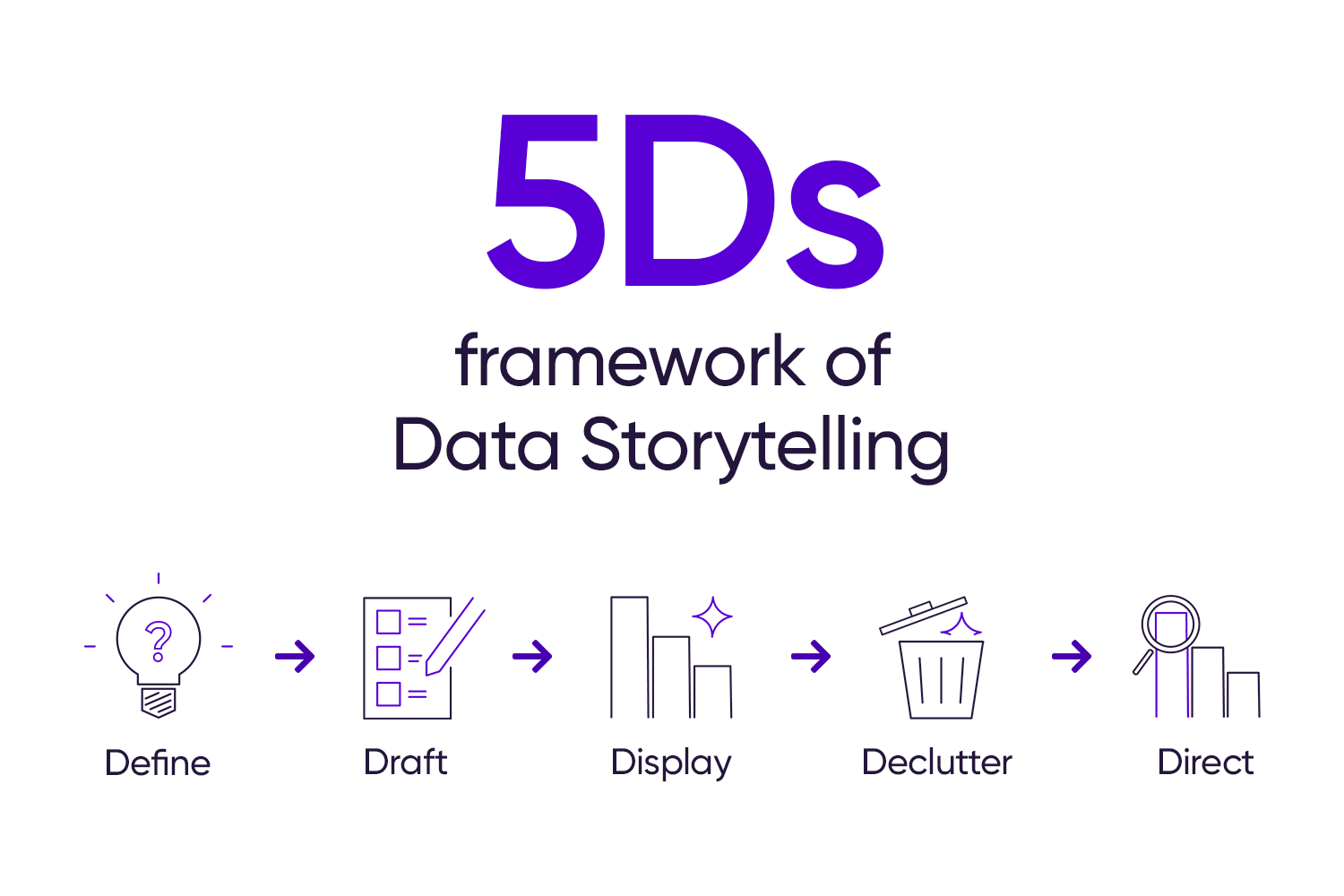
Introducing the 5Ds to Get Your Data Story Right
Delve into why critical thinking is the most vital skill in our data-saturated era. Gain insights on how to apply this skill against AI challenges.
Data storytelling is an approach to thoughtfully presenting data using narratives and visualizations, tailored to a specific audience's needs.
Discover how to leverage Excel's untapped potential, creating compelling sparklines and bullet Graphs for a clearer view on company performance.
Craft dashboards that resonate using the right metrics, visuals, and space.
Transforming combo charts into impactful visuals.
Adapting to audience needs: how mindful presentation choices elevate your data storytelling.
Why you should consider complementary colors for maximum impact.
Transforming good graphs into great ones with the innovative ESCape method.
Discover the comprehensive approach to problem-solving through issue trees.
Turn complex data into clear insights with impact metrics.
Prioritize your audience's needs and transform raw figures into actionable insights.
Elevate your slides - adopting design principles for better presentations.
Crafting a chart with purpose - minimizing ink and maximizing readability.
Visualizing data is a creative process - there isn't a single 'correct' chart that is the only solution for a specific set of data. This can make chart selection daunting for data storytelling beginners. Read more about StoryIQ's 'Display Decider', a tool for making chart selection easier.